About the Ezer brand
Creating a designer's brand
Ezer is a designer's brand, my brand specificaly, and it exists to portray my image as the studious, powerful and smart creator that I am. With a focus on fluidity, practicality, and attractiveness but never forgetting accessibility. It’s a brand developed to represent me, Lyliam Távora, in my different paths through the word of design, first as a graphic designer and multiartist and now as a UI/UX designer.
My abilities as a UI/UX designer are varied, going from ux researching, structuring and organizing information architecture, wireframing, prototyping and developing responsive interfaces.

Brand name
Ezer is a short, easy to remember version of the name Ezerom or Hezrom. It is a strong name meaning a driven person that gathers people together, so, as Ezer, I gather ideas and people together in my designs.

Logo meaning
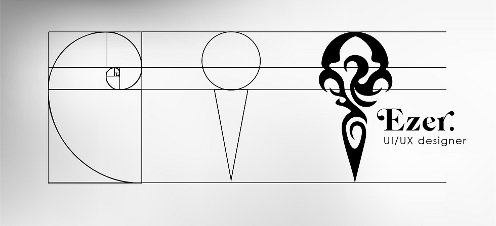
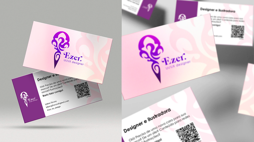
At the heart of this identity is the logo symbol, which serves as the principal key visual element. The symbol represents a crow's head or skull in my personal art styles. The visual system formed by the logo and the colors of the brand being mainly purple reinforces the brand’s core ideas of fluidity, practicality, and attractiveness, it also has a high contrast for accessibility

